
iTethr.
A community platform where international students find their people, powered by bubbles instead of tabs.
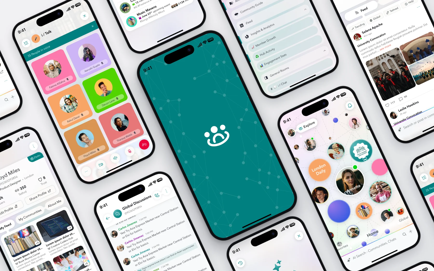
One place for your people.
iTethr is a community platform for international students, organisations, creators and global users. People build structured communities, offer services and connect through real-time social tools.
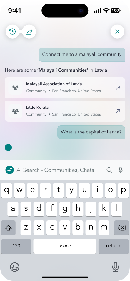
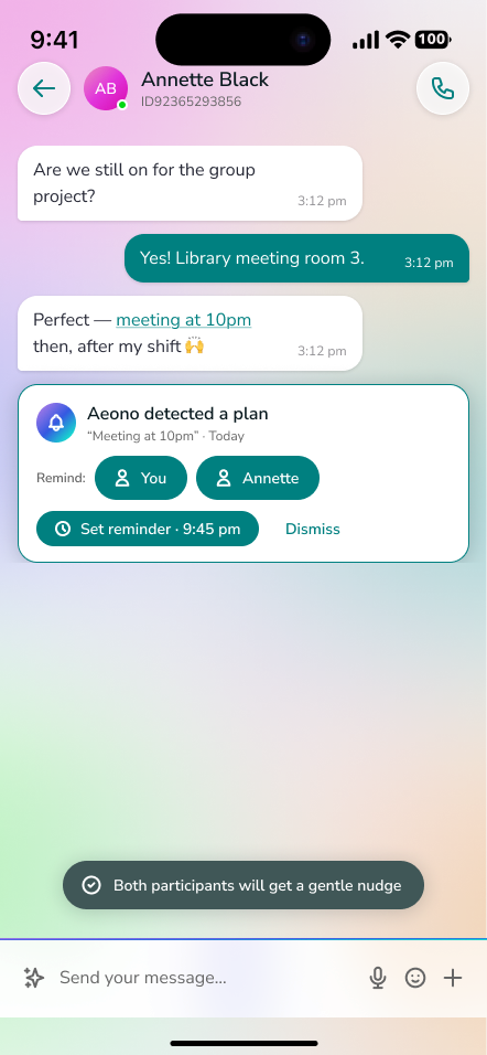
An in-house AI assistant, Aeono, runs through the product: in search, in chat and in the marketplace.
I designed the iOS app end to end for AeonovX SIA, a product company in Riga: product and interaction design, the design system and developer handoff.
Feeds and tab bars everywhere.
Social and community apps feel like endless feeds and tab bars. International students especially struggle to find their people, whether that’s university departments, local communities or trusted services, in one place. Institutions also lack a structured way to run many sub-communities under one roof.
From Home to the room.
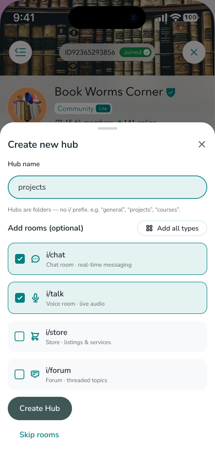
Every community follows the same nesting. The “i/” prefix means “inside” and doubles as brand language.
How it works.
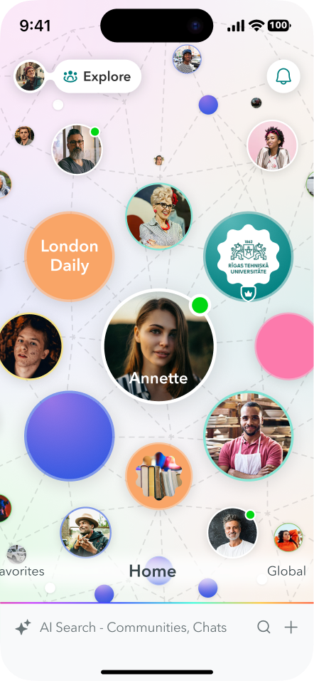
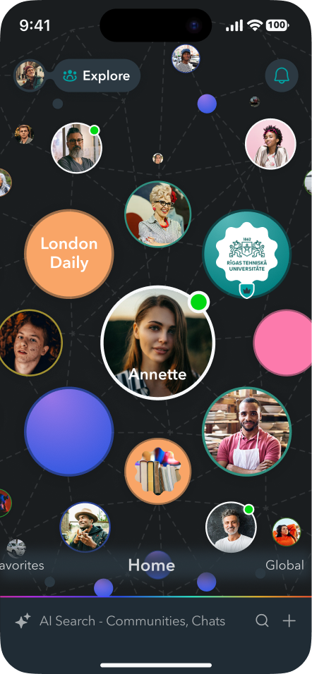
A Home without a tab bar
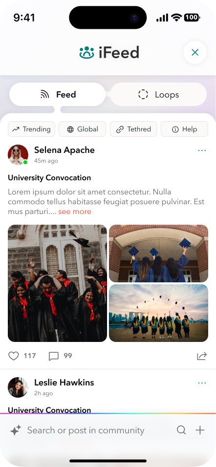
Floating, animated bubbles stand for communities and connections, so Home feels spatial and present. The Aeono AI search bar sits at the bottom, iFeed is top-left, and Marketplace and Notifications are top-right.
Spaces
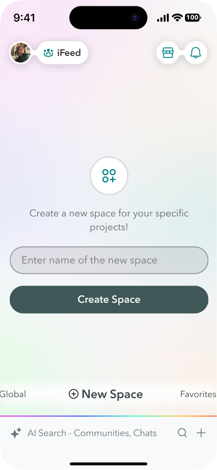
Swipe between Home, Favorites, Global and custom Spaces such as “Study Room” or “Startup Notes”. Long-press any bubble for quick actions.
Structured communities
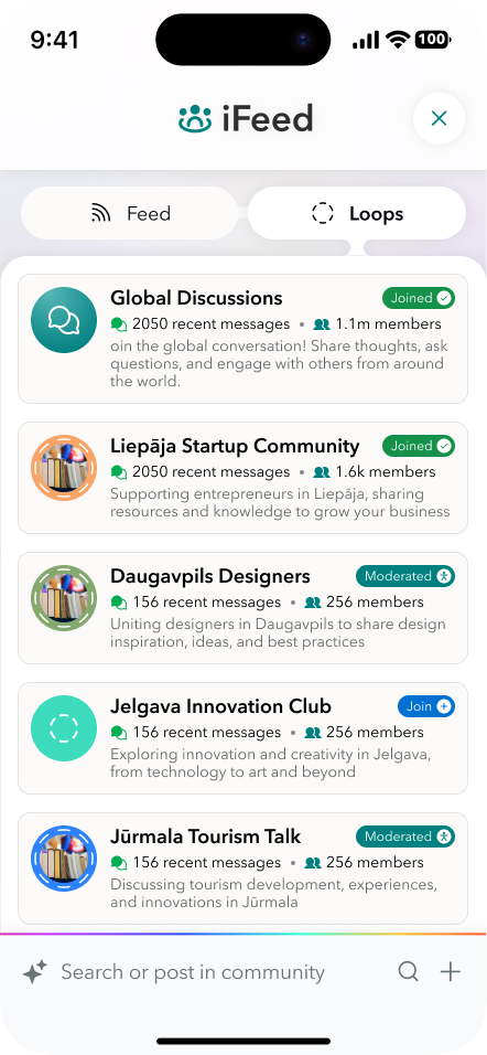
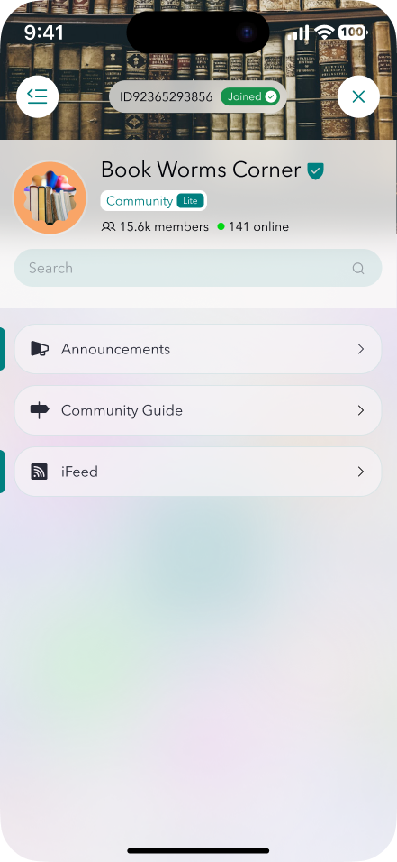
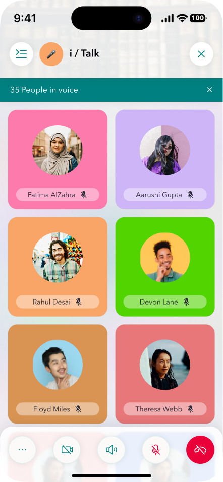
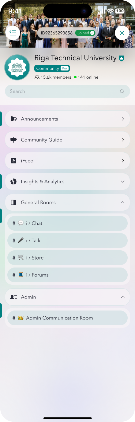
A community holds Hubs, and each Hub holds i/ Rooms for chat, voice, a store and a forum. Members always know where a conversation lives.
Community Pro & i/Communities
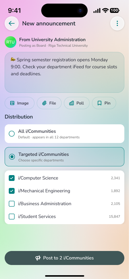
For institutions such as a university with departments. Board members send targeted announcements that cascade to departments, and an admin bridge connects board and department admins.
Aeono AI throughout
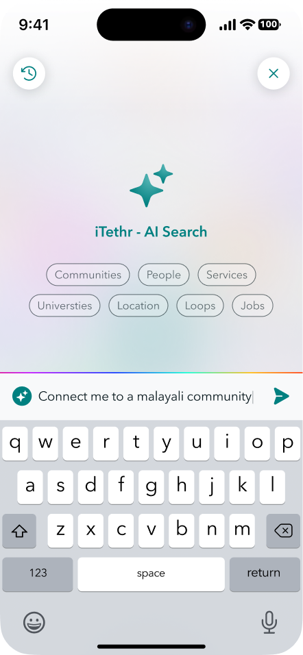
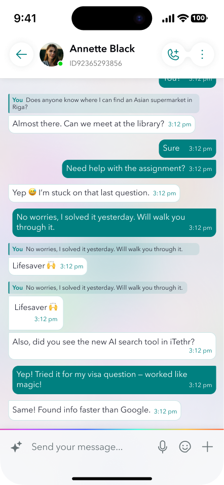
Conversational search with a choice of model, and smart reminders detected from chat, such as “meeting at 10pm”.
Tethr connections & trust
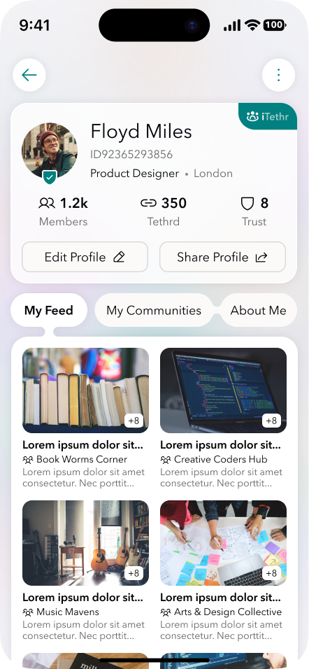
Connections are mutual and consent-based instead of follow and follow-back. Profiles show a Trust Score, Tethrd level and verification badges for Students, Freelancers and Professionals.
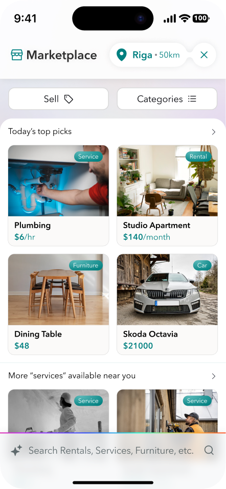
Marketplace
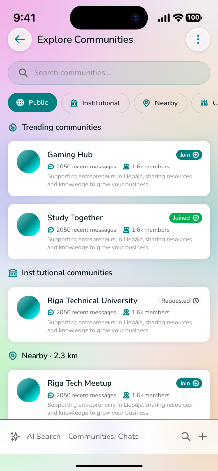
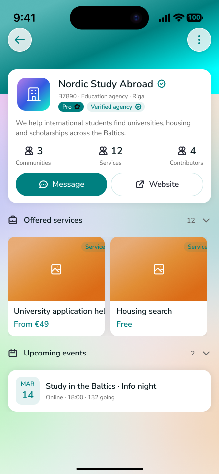
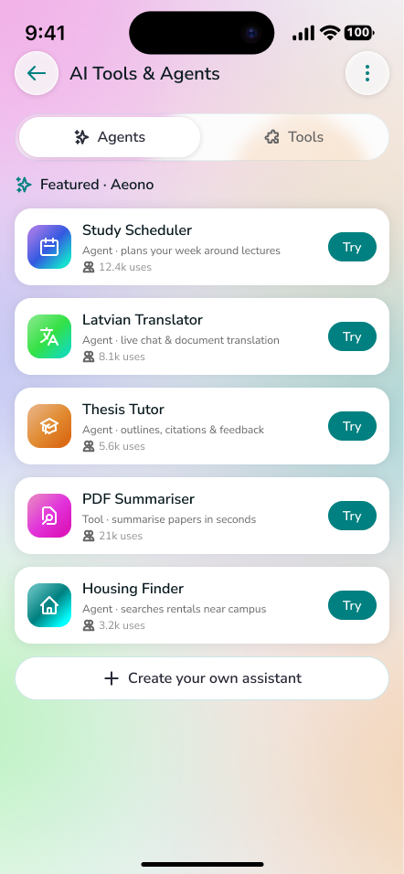
Services, rentals, events and AI tools & agents, found by category and reached by DM or external link. Payments and reviews were deliberately left out of V1.
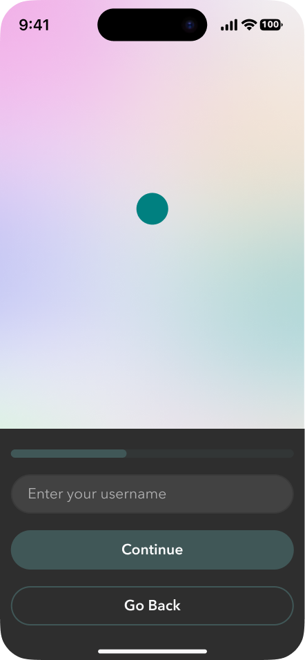
Three steps in.
Username, then date of birth and gender, then interests and privacy. New users land in Home with their personal “You” chat.

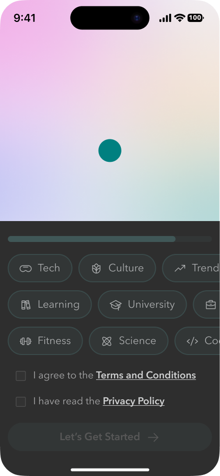
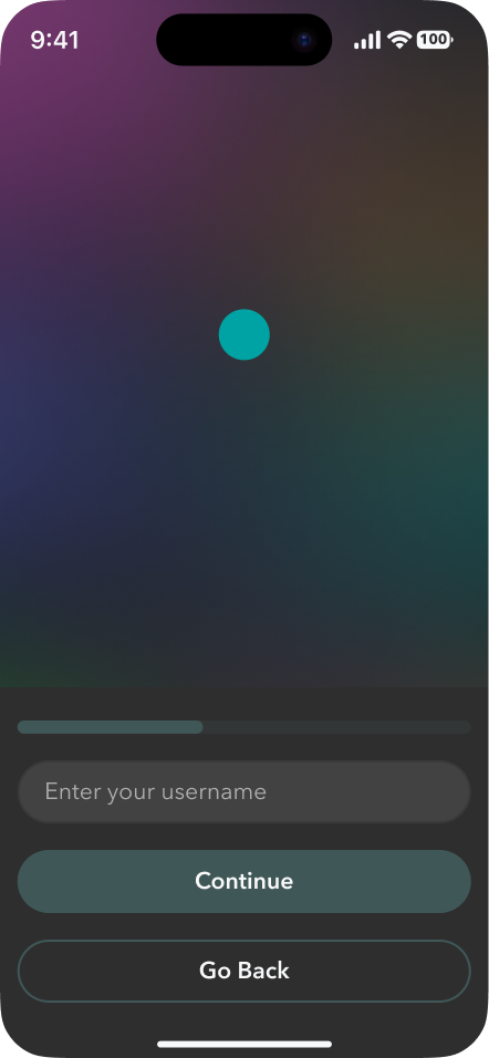
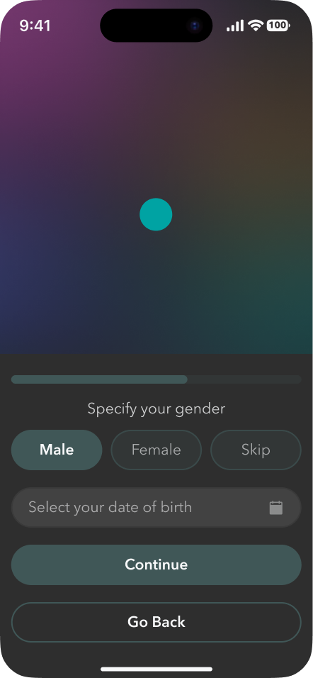
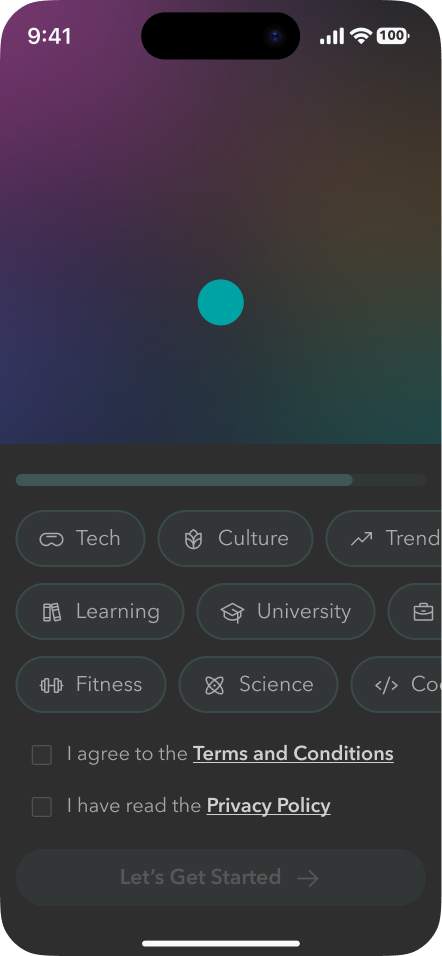
Every colour is a variable.
The full palette
Semantic tokens with Light and Dark modes
Spacing, radius and sizes
Family, weights and sizes
Dark screens are the same layouts with the Theme mode switched. The base screen template changes its background with the mode.
The community bubble has five states: Standard, Pro ring, Private, Pending and Admin. Effect styles cover soft shadows and glass blurs, and the seven bubble gradients are Aurora, Orchid, Sunset, Ember, Mint, Lime and Lagoon.
Same layout, both modes.
What shipped.
- 10 complete user flows, ~150 screens in Light and Dark
- A scalable system: 45 components, ~300 tokens
- A dev-ready file organised by flow, with numbered screens
Spatial UI needs clear anchors. Bubbles make Home feel alive, but fixed positions for search, iFeed and notifications are what keep it usable.
Structure pays off at scale. Community → Hub → i/Room gave every new feature, from Community Pro to the admin bridge, an obvious home.
Theme tokens early. Binding every colour to a semantic variable made dark mode a mode switch rather than a second design.
In motion.
A clickable Figma prototype of the app.
Click inside the frame to interact · Use the fullscreen icon for the best view