
Nuvionx.
Nuvionx Ltd is a UK-based clinical engineering company that maintains, calibrates and repairs medical equipment for hospitals and healthcare centres. I designed the brand identity and a responsive website that presents its services with the precision and reliability the sector expects.
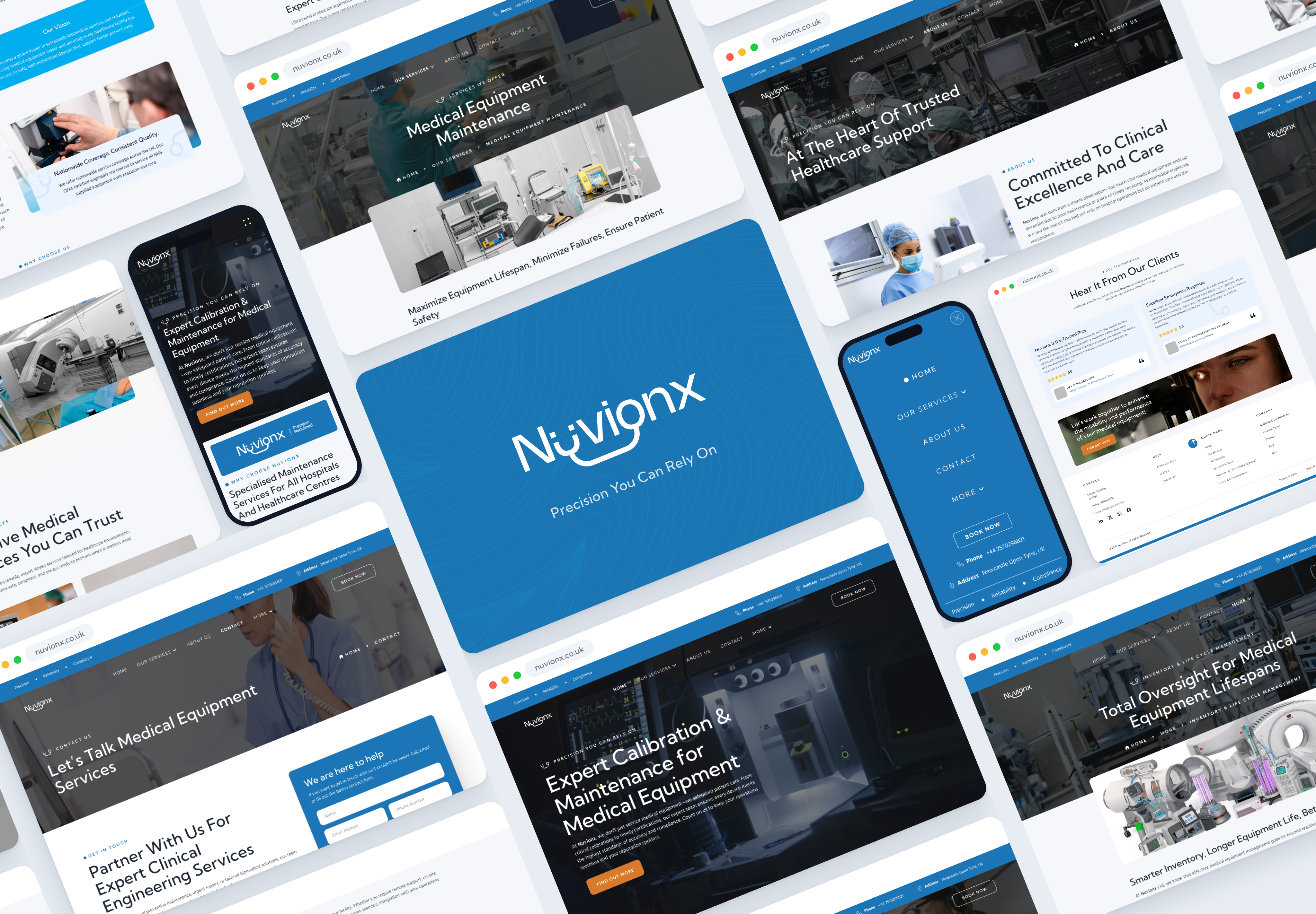
Precision you can rely on.
Nuvionx services the equipment hospitals depend on: maintenance, calibration, ultrasound probe repair, bed management and asset audits. The people choosing a provider are clinical engineering teams and facilities managers, who need to see capability, coverage and compliance quickly.
The company needed a brand and a website from scratch. The site had to explain a technical service catalogue clearly, earn trust before the first call, and work equally well on a desktop in an estates office and a phone on a ward.
Ten pages, three breakpoints.
- Home
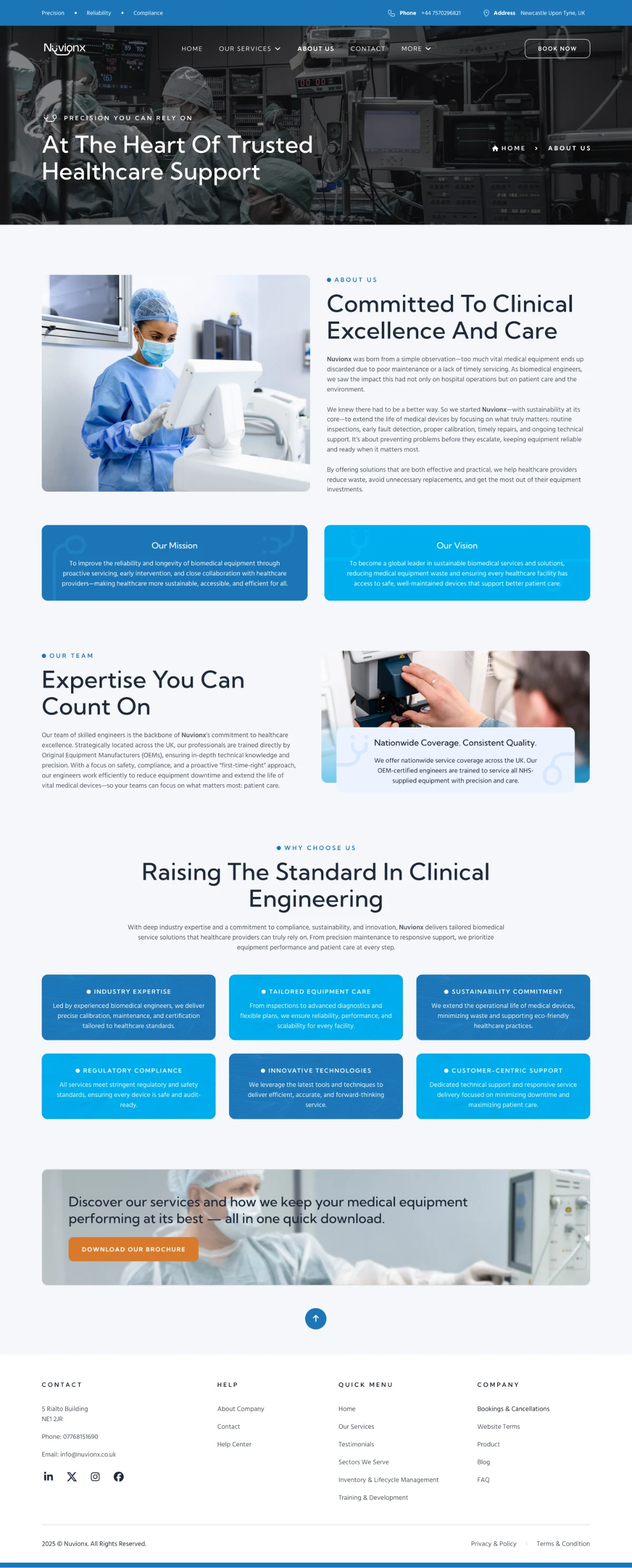
- About Us
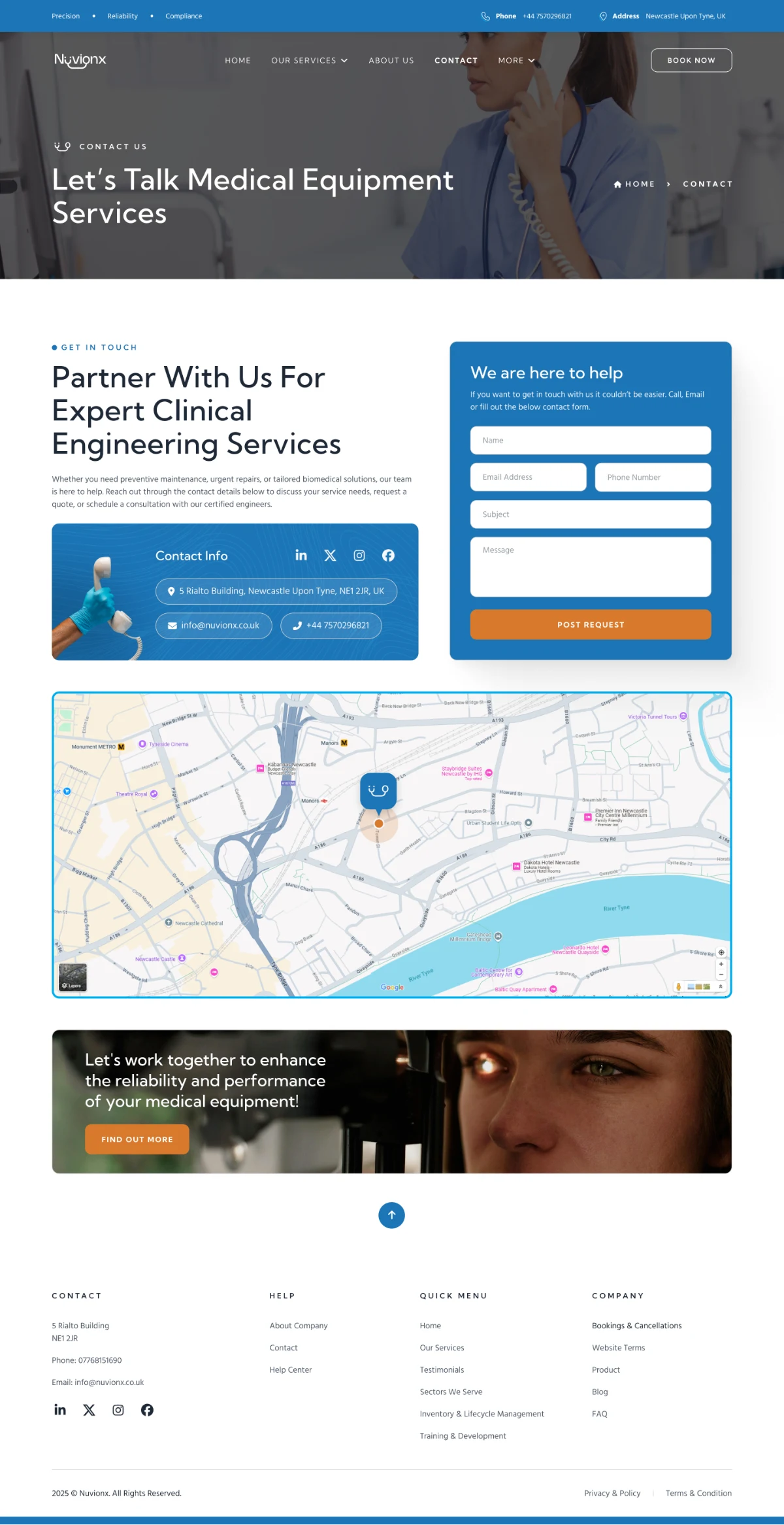
- Contact
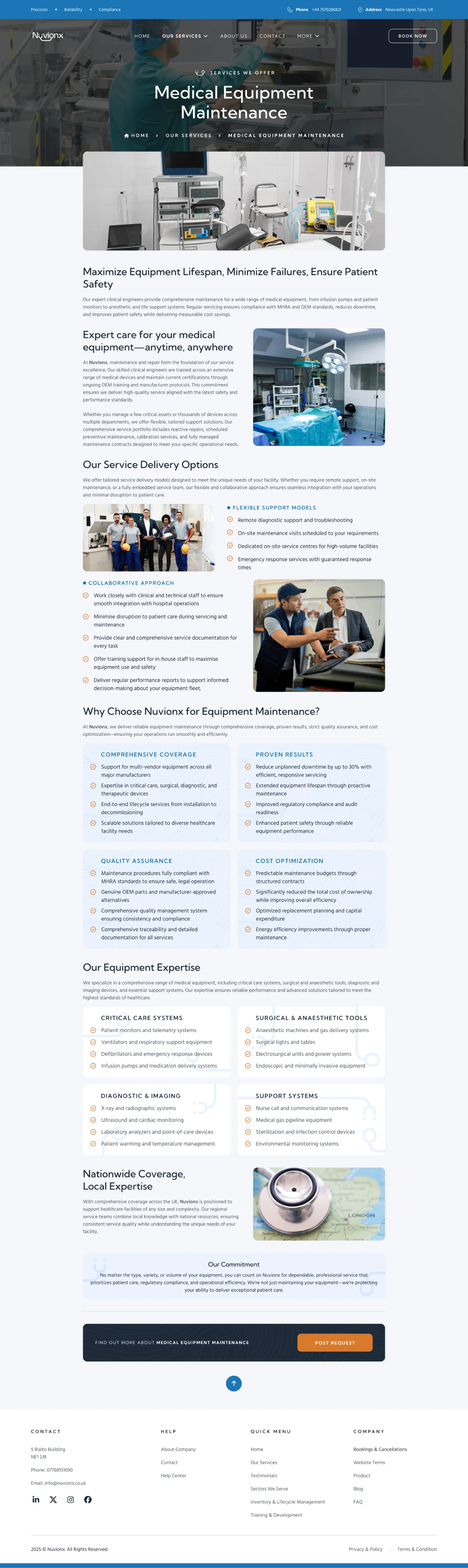
- Medical Equipment Maintenance
- Clinical Engineering Support
- Asset Management & Audit Support
- Professional Hospital Bed Management
- Ultrasound Probe Repair
- Sectors We Serve
- Inventory & Life Cycle Management
Every page was designed at desktop, tablet and mobile, with dedicated navigation menus and service dropdowns for each size.
Clinical, not cold.
Trust signals up front: a persistent Precision · Reliability · Compliance bar, contact details in the header, and client testimonials on the home page.
Services first: each service gets its own page with a consistent hero, benefits and enquiry form, so buyers can compare like for like.
Real environments: photography of labs, wards and equipment in dark, blue-graded heroes, set against light content sections.
One system, three sizes: shared components for buttons, service cards, feature cards and forms across every breakpoint.
A mark with a pulse.
A deep medical blue carries the brand, headers and navigation; a brighter cyan picks out calls to action and icons. Kumbh Sans sets headings with a clean, engineered feel and Hind Madurai keeps long service descriptions easy to read.
The website.

Built for the ward, too.
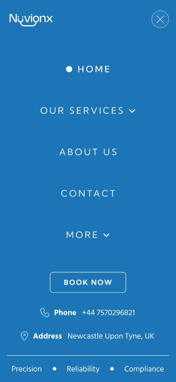
Tablet and mobile layouts reflow each section and replace the dropdowns with a full-screen blue menu that keeps phone, address and Book Now within reach.



In motion.
A clickable Figma prototype covered the full site: an animated logo splash, navigation and service dropdowns, and scroll-triggered reveals on headings, images and buttons, handed over as the reference for development.
Click inside the frame to interact · Use the fullscreen icon for the best view