
Rethinking
Instants.
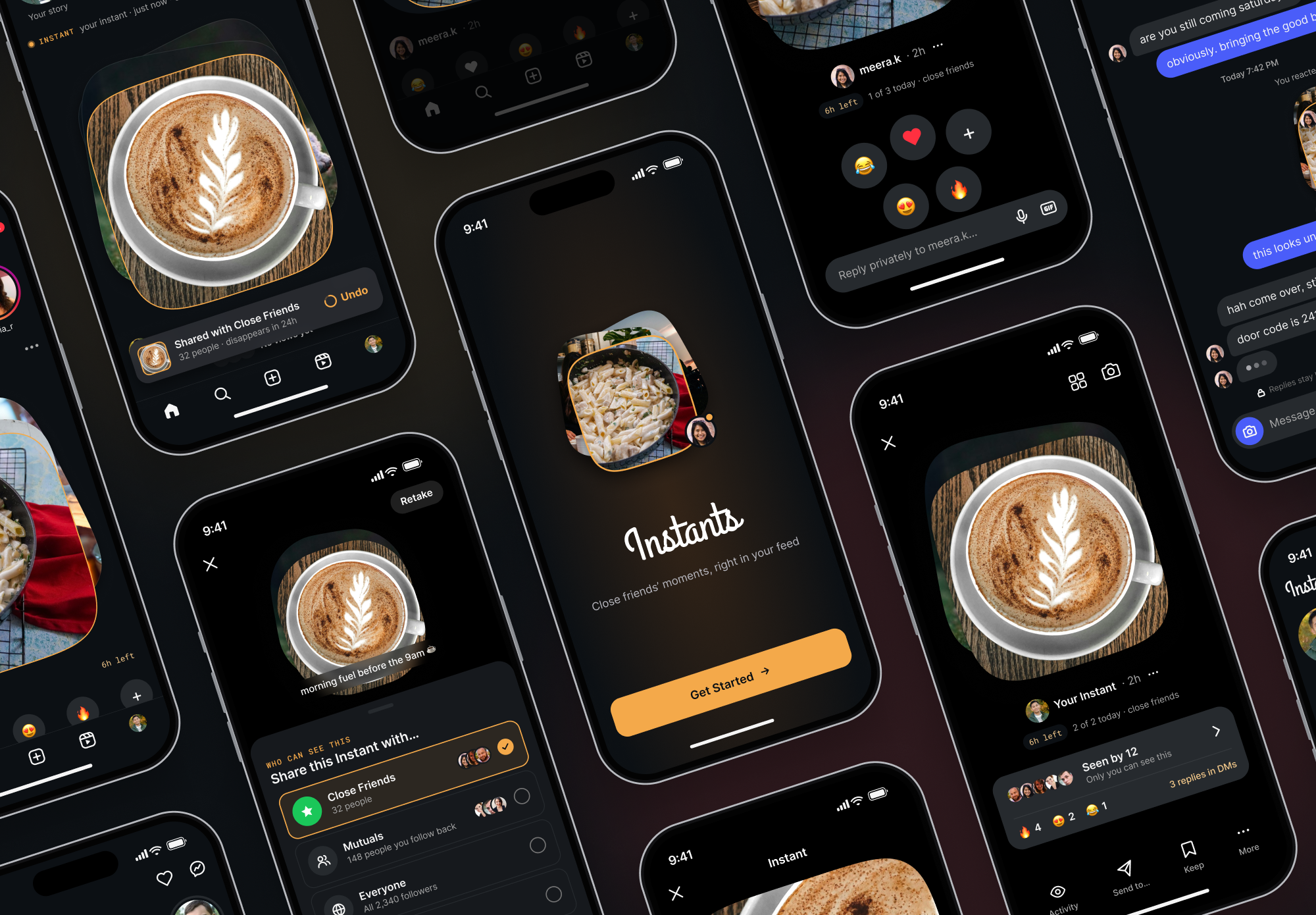
Instagram's Instants are quick, unfiltered moments shared with close friends that disappear after 24 hours — and almost nobody finds them. I moved them out of the DM inbox and into the home feed, and rebuilt sharing around consent, undo and private reactions.
This is a concept redesign of an Instagram feature for a portfolio. It is not affiliated with Instagram or Meta. Photos are from Unsplash, portraits from randomuser.me; the people are fictional.
Nobody could find it. Nobody trusted it.
Instants live behind a floating "pile" inside the DM inbox, and almost nobody finds them. They also publish the moment you capture, with no audience choice, no confirmation and no undo.
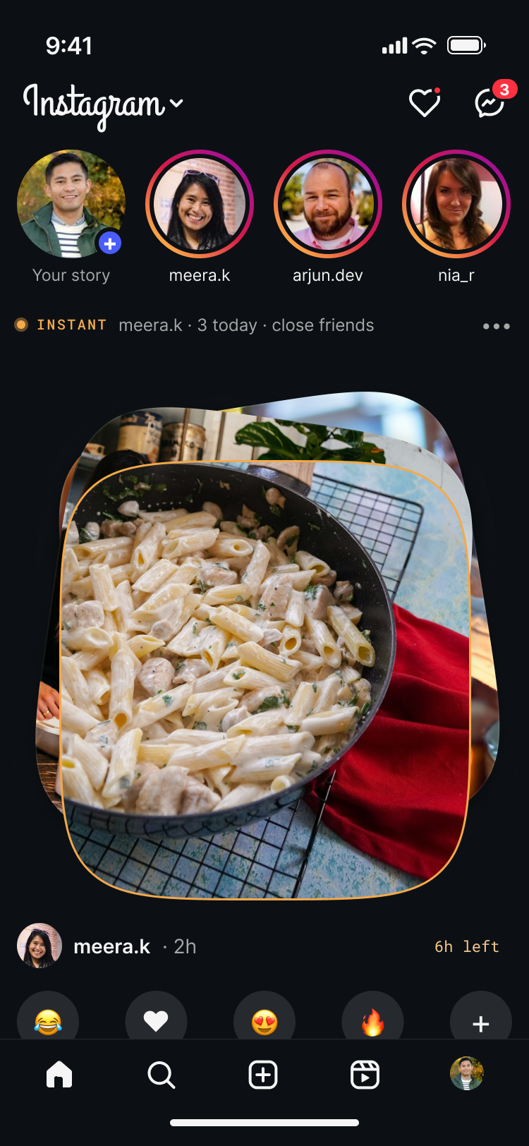
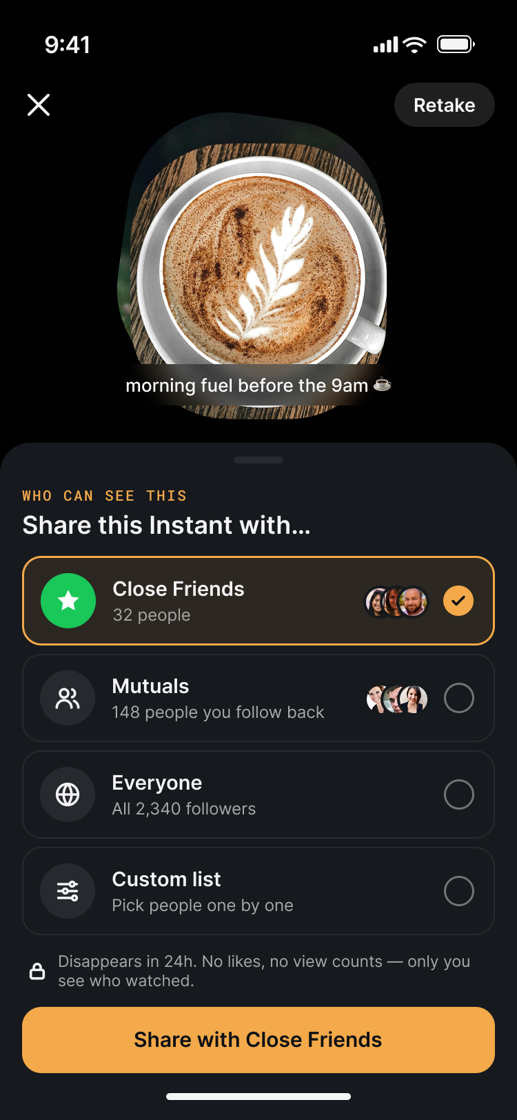
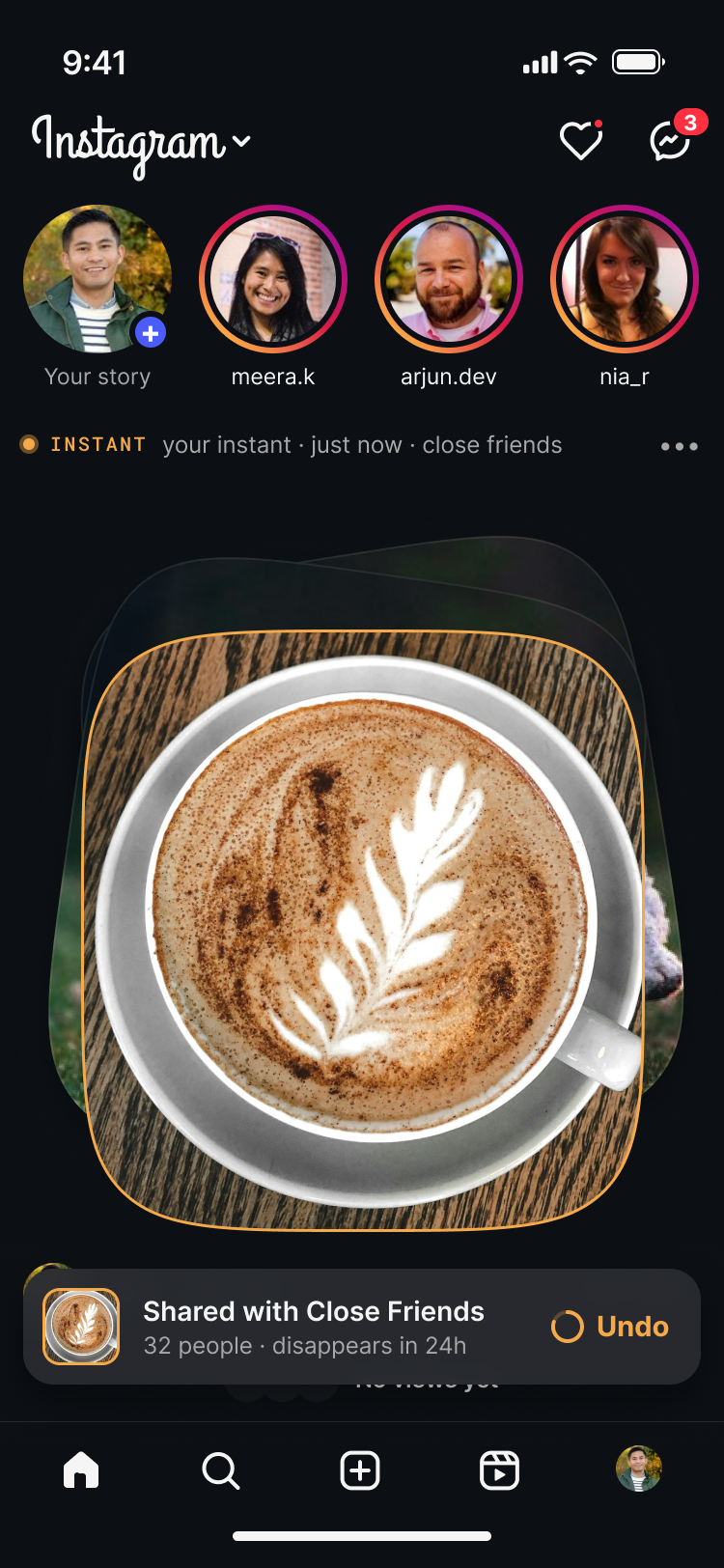
The redesign moves Instants out of the DM inbox and into the home feed, adds a consent step to choose who sees it, a 10-second undo, private-only reactions, clear attribution and a visible countdown. It adopts Instagram's current stacked squircle card so it still feels native.
What is Instants?
Instants are quick, unfiltered photo moments shared with close friends that disappear after 24 hours — a "real moment" counterweight to polished feed posts.
In the current app they live behind a floating pile inside the DM inbox. A broadcast feature sits inside a 1-to-1 messaging surface, competes with threads for attention, and most people never notice it is there.
Core thesis: Instants belong in the feed, not the DM inbox. The DM-inbox pile is the problem being solved, and it was deliberately left out of the final design.
Six ways it fails.
0 of 8 participants found Instants without help. The feature is effectively invisible.
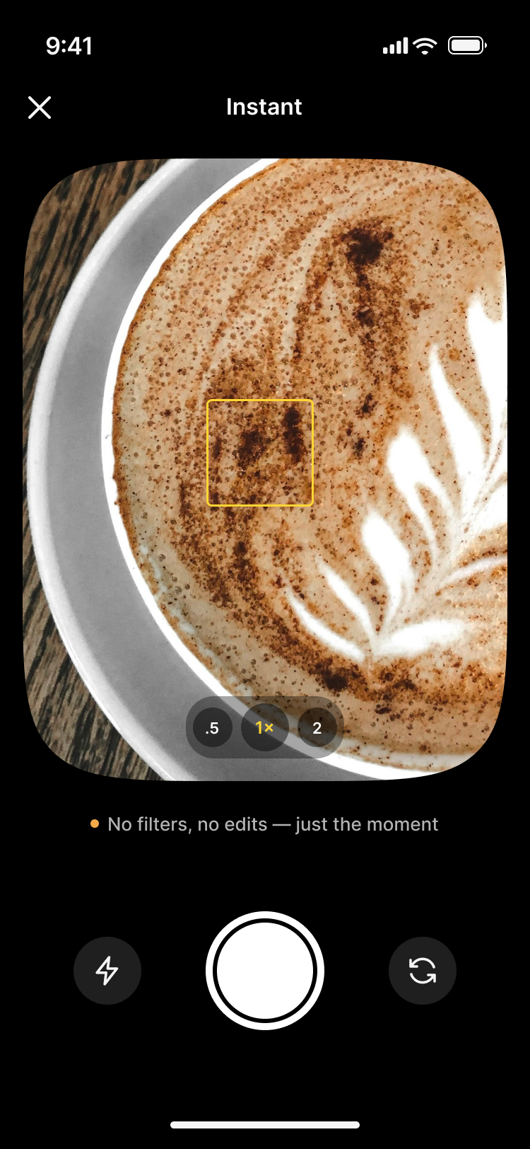
Pressing the shutter shares the moment. People shared without ever choosing an audience.
Accidental shares couldn't be reversed. One mistake is enough to make someone stop opening the camera.
Weak attribution. Viewers couldn't tell who had posted what they were looking at.
No sense of how many Instants a person shared, or how long they last — so no sense of urgency.
Unfiltered sharing feels risky when it is measured. Metrics work against the point of the feature.
Testing my assumptions
A heuristic evaluation against Nielsen's 10 usability principles, then moderated sessions with 8 active users of the app (ages 21–34, daily users) attempting three tasks: find Instants, view a friend's, and post one.
0 of 8 found Instants unaided within 2 minutes. When shown its location, the most common reaction was "why is it in my DMs?"
6 of 8 asked some version of "whose photo is this?" within the first three viewed Instants. Two assumed the content was ads.
8 of 8 were surprised captures auto-send. 5 said they would not use the camera again after learning this. Trust, once broken here, did not recover within the session.
"Wait — it already sent that? To everyone? That's horrifying."
— P6, usability session
Two people to design for.
Posts stories most days. Loves the idea of low-pressure "real" moments but abandoned Instants after one session because she couldn't tell who saw what.
- Effortless posting — under 10 seconds
- Certainty about who sees each post
- To see friends' moments without hunting
Follows colleagues and clients alongside friends. Views often, posts rarely — and only when he's certain of the audience. One accidental share would be a career problem.
- Explicit confirmation before anything is shared
- A trusted, reusable close-friends list
- An obvious way to undo mistakes
How might we…
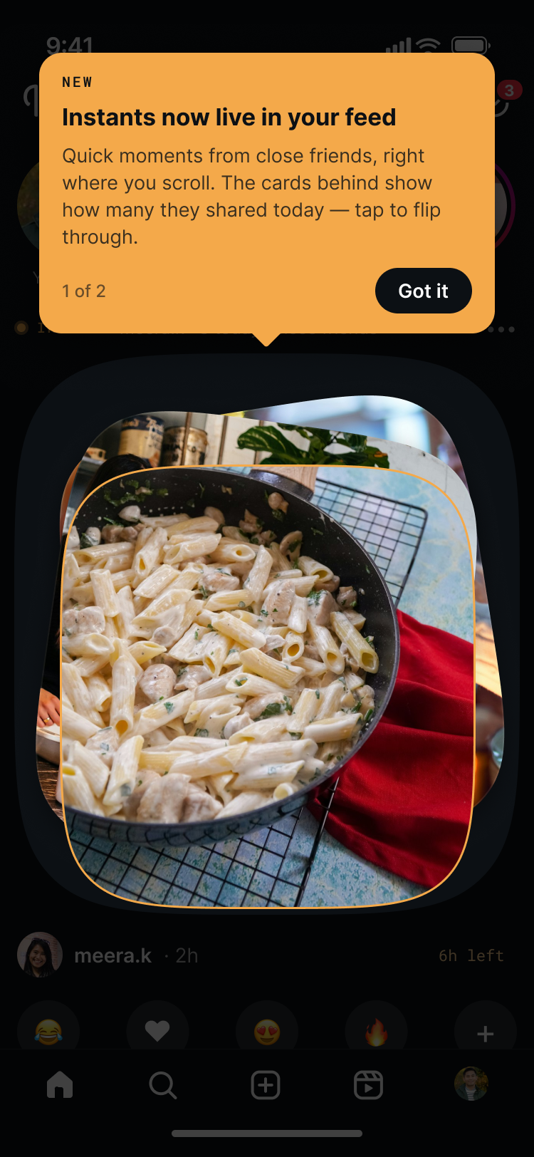
Make Instants findable — move them out of the DM inbox and into the home feed, where attention already is.
Attribute everything — avatar, name, time and countdown pinned under every card.
Make quantity and time visible — stack depth shows how many Instants today; a countdown shows how long is left.
Never share without consent — separate capture from sharing, ask who sees it, and allow a short undo after.
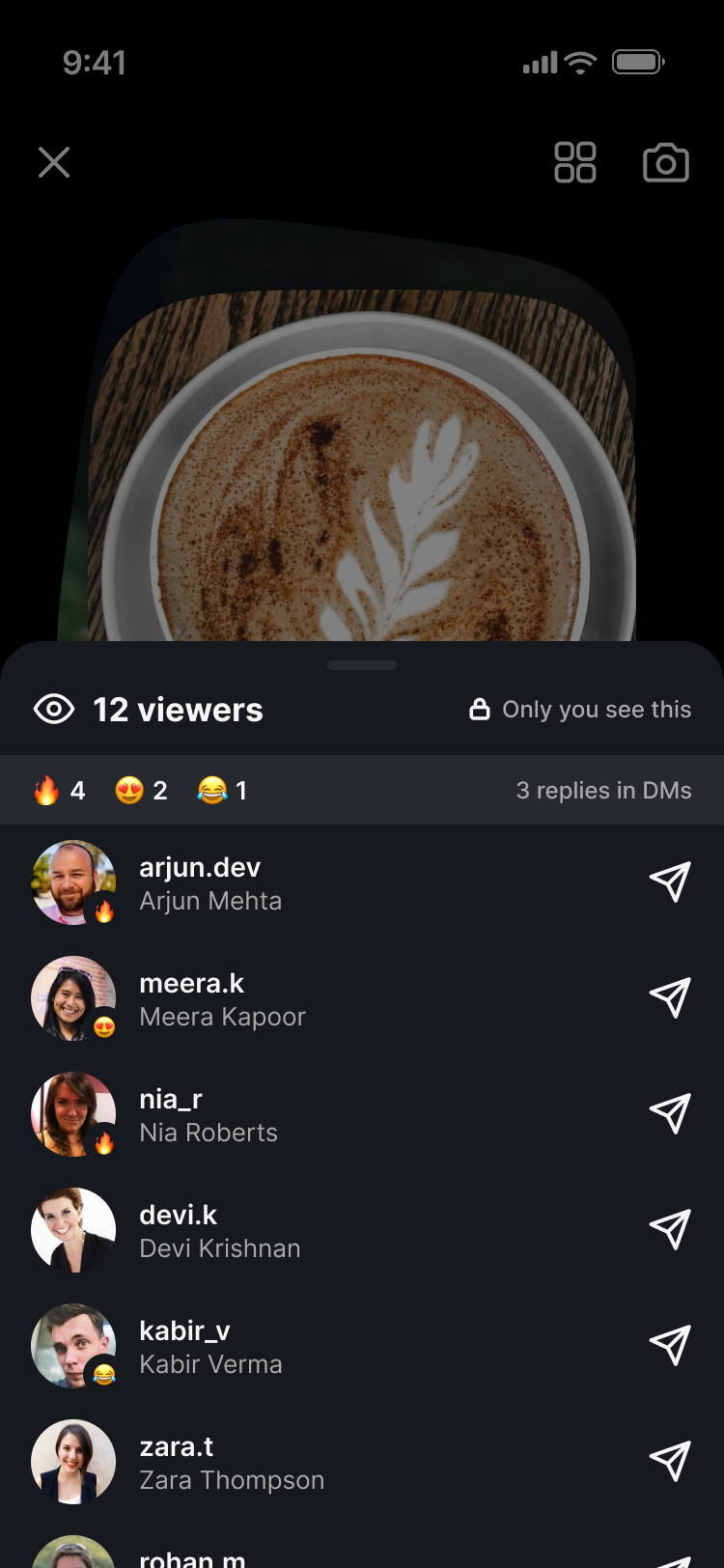
Keep pressure low — private reactions only; view counts shown only to the owner.
From new component to native card.
A full-width card with a bordered rounded-rectangle photo, an amber glow, segmented progress pips on the photo and an attribution overlay on top of the image. It worked, but read as a new component rather than part of Instagram.
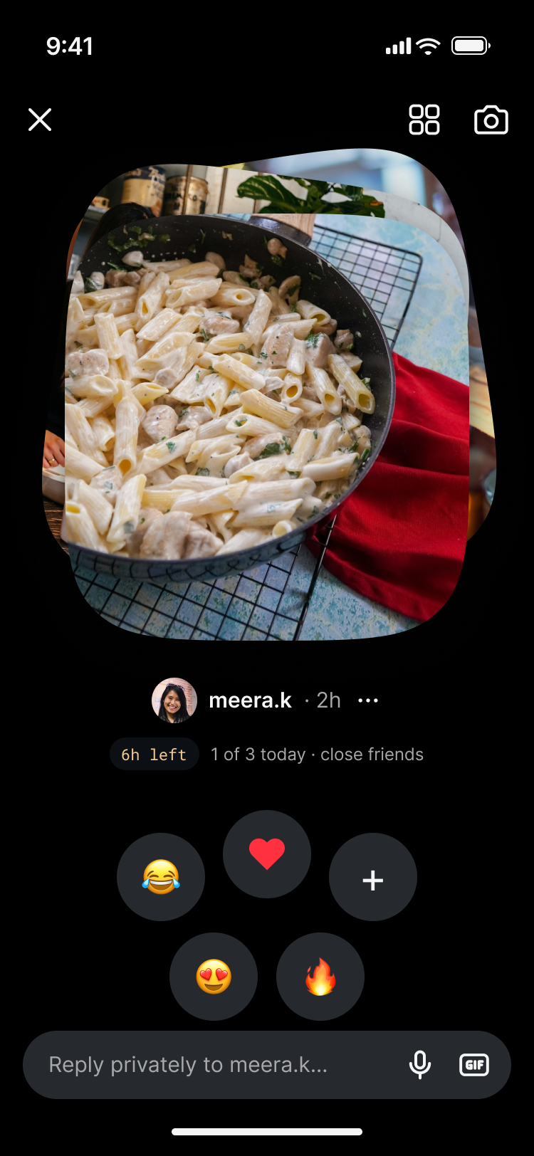
Compared with how Instants look in the live app: a squircle photo with earlier Instants stacked and tilted behind it, attribution below the card, big round reaction buttons, and a reply bar with mic and GIF.
The stacked squircle was adopted and given meaning: the number of cards behind the photo is how many Instants that person shared today. Countdown, private reactions, consent and undo were kept.
The visible stack already tells you there are more Instants, and tapping flips through them. A second indicator was redundant.
Recreating it even as a "secondary entry point" undermined the whole thesis. Removed.
A colour was reserved for them, but they were never needed in real screens. Removed to keep the palette tight.
Instants, in the feed.
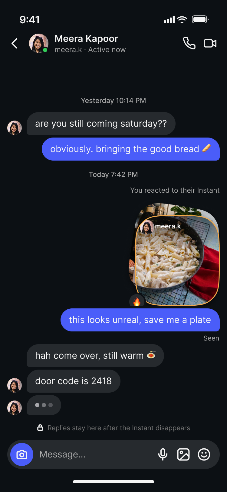
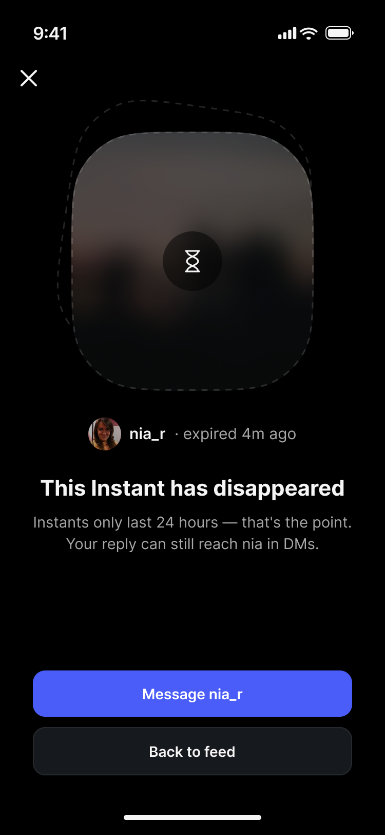
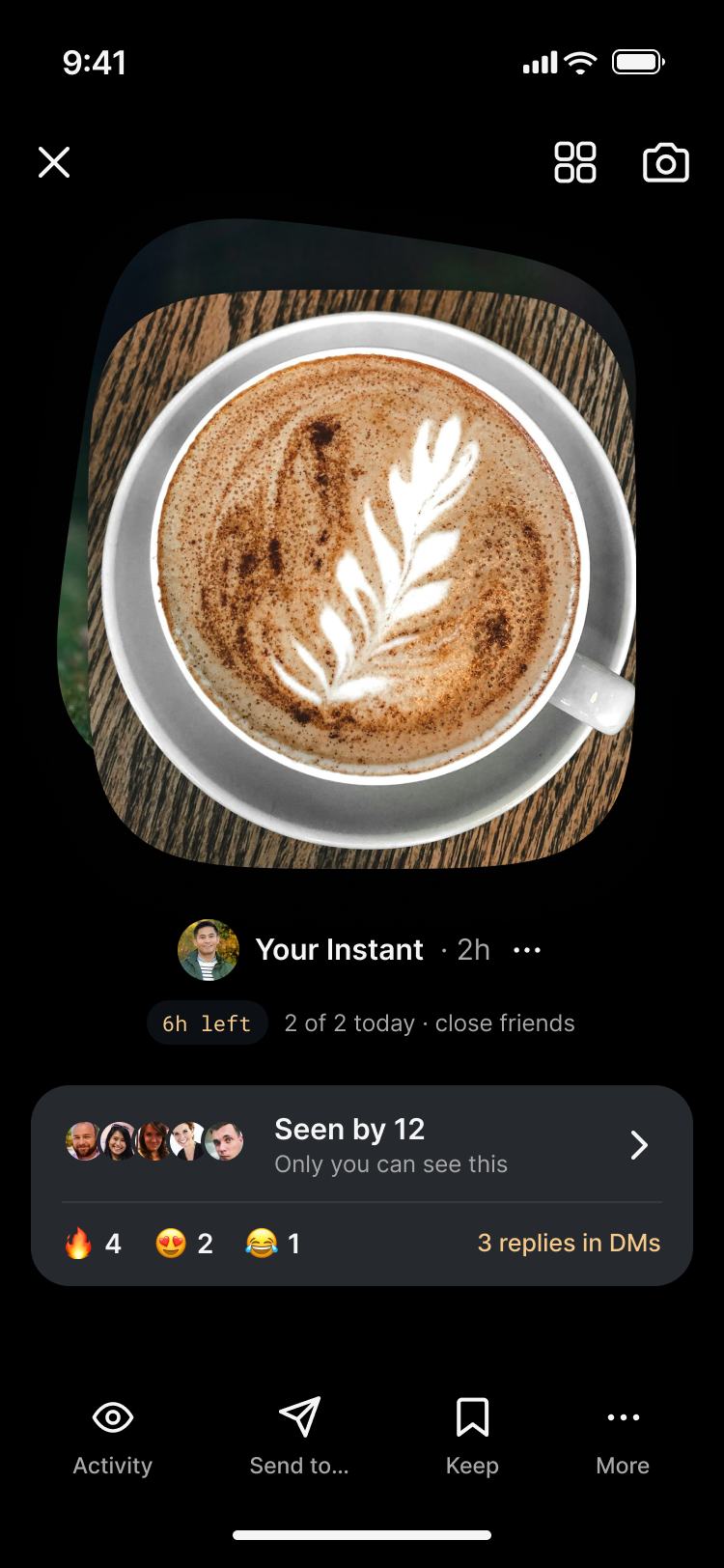
Twelve iPhone screens in dark mode, with one consistent cast so the flow reads as a single story: Meera shares three Instants today, you share a latte, Nia's sunset expires.
Core flow
From the feed, through capture and consent, to a private reply.
States & edge cases
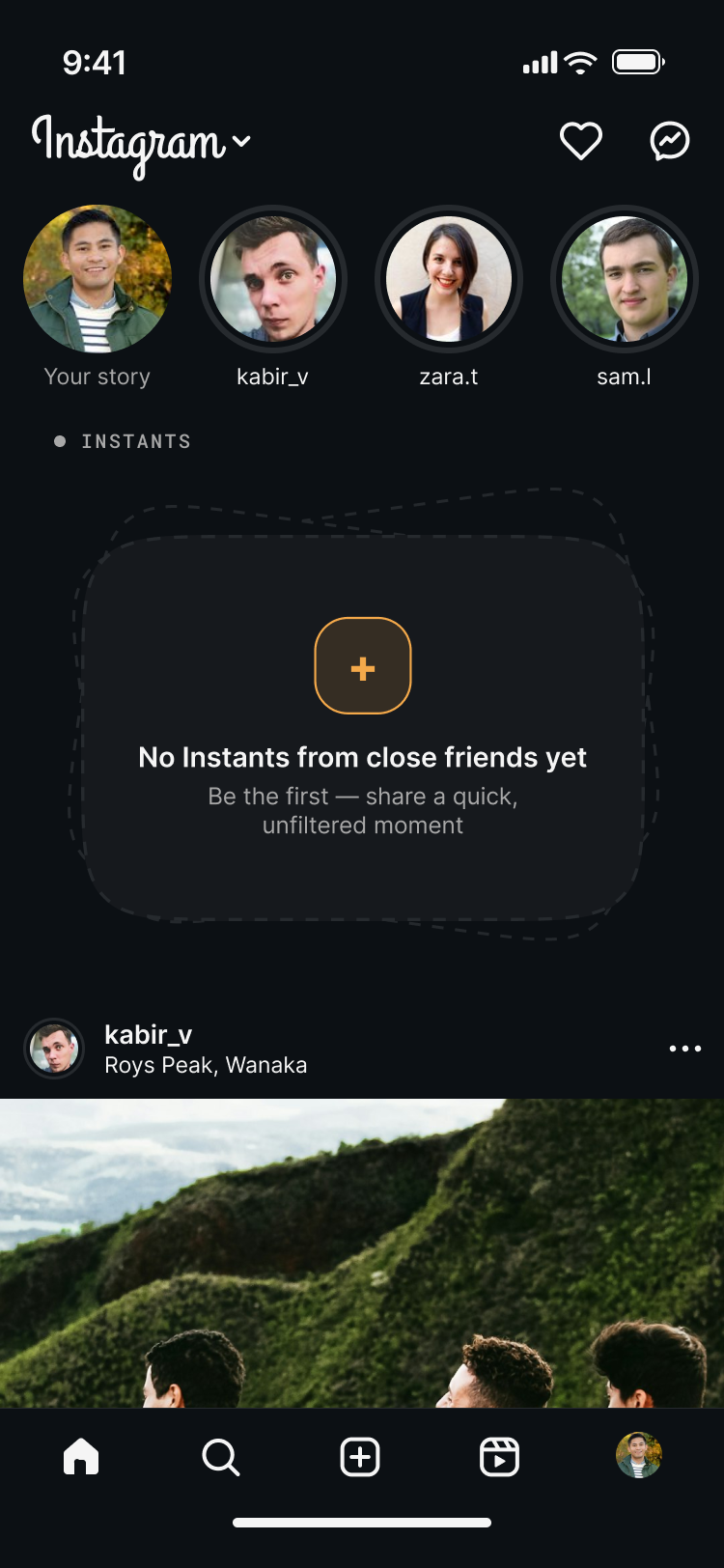
What happens when there's nothing, when it's yours, and when it's gone.
Full scroll
Every Instant state in context, between real posts.

The Instant Card
One component, five states. Stack depth = Instants today.
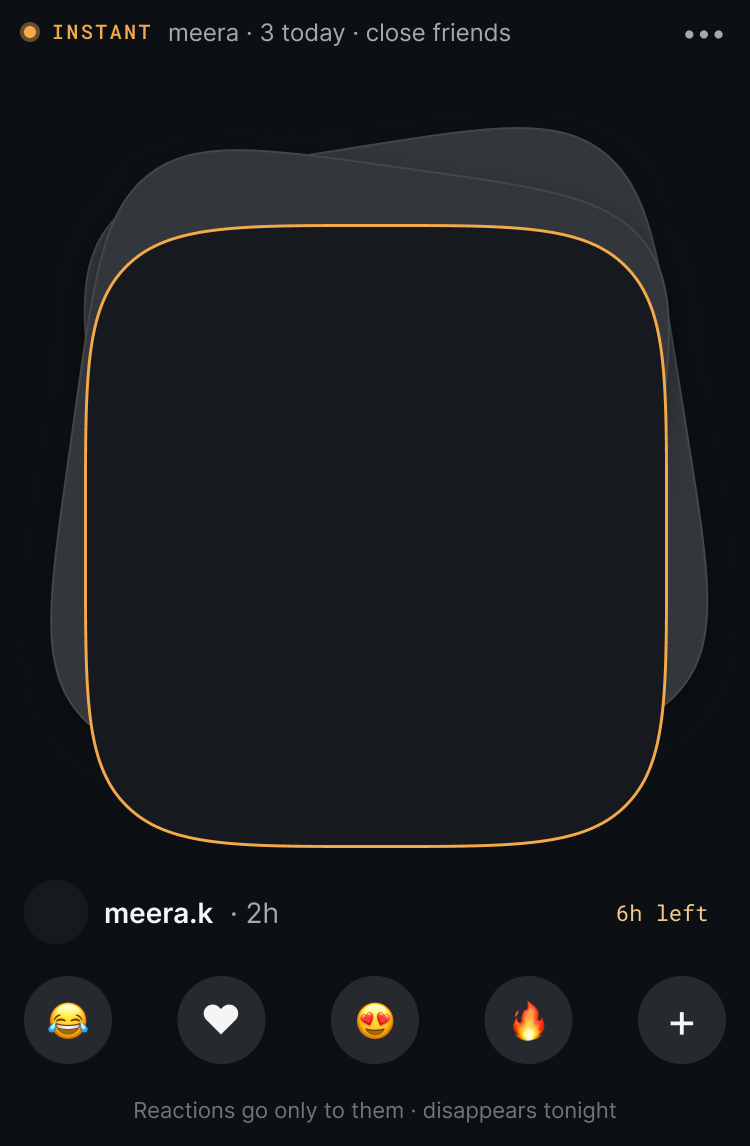
Amber border and glow.
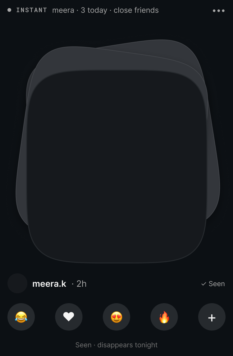
Dimmed, no glow.
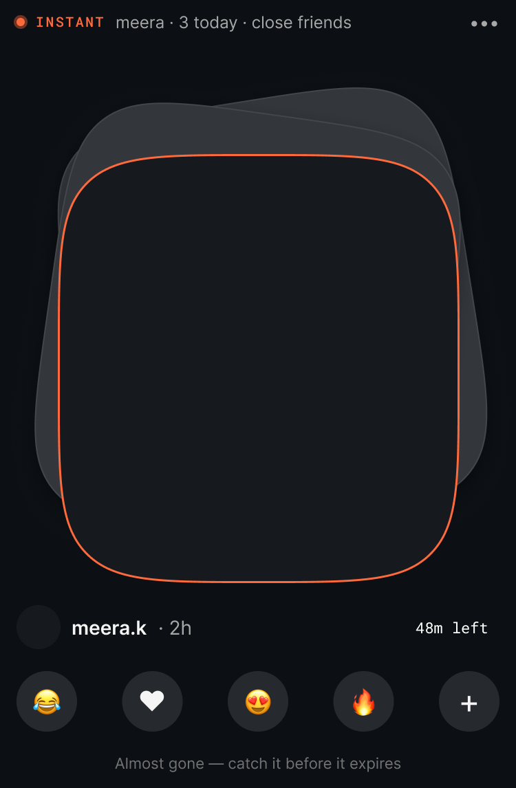
Red border and glow, with a red countdown chip under 1h.
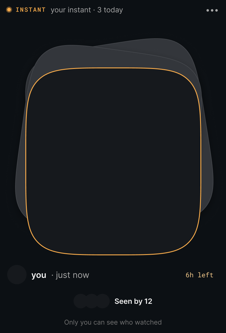
A seen-by row replaces the reactions.
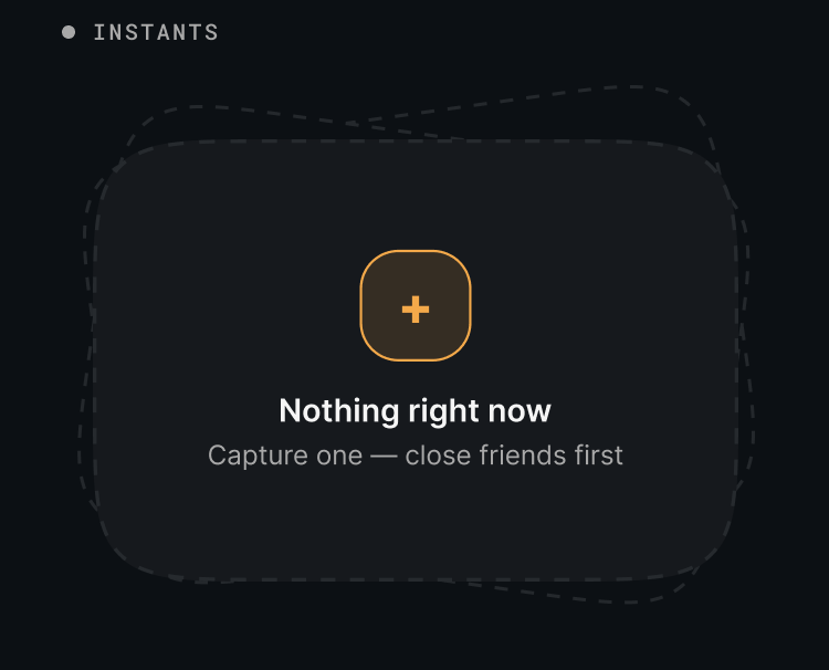
A dashed ghost stack.
Amber means Instant.
A dark theme based on Instagram's real dark-mode values. Blue is Instagram's general action colour; amber only ever means "this is an Instant"; red only ever means "about to disappear". Story rings keep Instagram's own gradient.
Squircle radius 72 with full corner smoothing — the Instant card's signature. Other radii: 0 / 4 / 8 / 16 / full.
4 · 8 · 12 · 16 · 20 · 24 · 32 · 48. Touch target 44; avatars 24/32/44/56/77; icons 20/24.
Inter as the system-font stand-in for SF Pro. Roboto Mono for "INSTANT" labels and timers. Grand Hotel for the wordmark.
Every problem, answered.
Trade-offs I made.
What I'd test next
This is a concept; there are no shipped results. The next step is a usability round on the prototype to validate discoverability of the in-feed card and the consent step.
I'd also test whether the consent step adds friction for frequent sharers like Meera, and how the feed cadence holds up when many close friends post on the same day.